Best Case Scenario

If you’re not careful, an eLearning lesson can quickly devolve into an “information dump” where learners are barraged with a huge pile of data with no opportunity to apply it to their everyday lives. This often happens when you have an overly price-conscious client who’s looking for a lot of production on the cheap, or a client who has not filtered out all but the most essential and relevant content from the course.

I recommend that for every five minutes of content you should have some sort of interaction where the learner gets to do something to apply what they have learned. These can be something as simple as a multiple choice question or a drag and drop interaction, or you can create a branching real-life scenario. There are all kinds of interactions which will break up the lesson, and help the learner to think about what they’ve learned instead of just glazing over as the information flies by them.

Memory Palaces

Interactive scenarios put the learner in a real-life situation where the information they’ve learned can be applied in their daily lives. Memory pro Ron White uses “memory palaces” to remember long lists of names and other data. He once used this technique to remember the names of about 40 people walking into a movie theater. If the first person’s name was Tim, he would imagine walking into the first room in a large palace and there was a clock on the wall making him think of “time” or “Tim”. If the next person’s name was John, he would think of a bathroom with a toilet, and so on. So he would associate each name with an object in each imaginary room of the palace and then simply walk through it in his mind to remember the string of names. Memory palaces work because they form a kind of visual narrative in the person’s head. Our minds are programmed to remember stories, and that’s just what scenarios are.

Have the Interaction Match the Situation

So with interactive scenarios, we are telling the learner a short story. One of my clients was in the fire fighting field in Alaska. Oftentimes, there might be more than one forest fire going on at a time, and the managers needed to know how to prioritize which fires to fight first, second, and so on. So I presented the situation in just a few sentences with beautiful pictures of the Alaskan mountains, lakes and towns on the screen. Instead of doing a typical branching scenario where the learner is given about 3 or 4 options on what to do, I decided to make it into a sorting interaction, because sorting the fires in the order of their priority was exactly what we needed the learner to be able to do on the job.

Consequences are Memorable

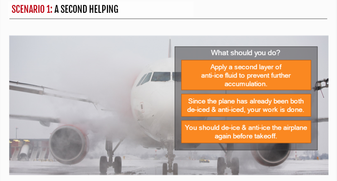
Whether it is a branching scenario, sort interaction, or something else, you want to give the learner feedback after they’ve decided what to do. Whenever you are teaching someone to do something a certain way, that must mean there is a right way to do it with positive consequences or a wrong (or less-than-ideal) way to do something with negative consequences. In one branching scenario I wrote for a client in the aeronautics industry, they learned when and how often they needed to de-ice an airplane so it would be safe to fly. This was an easy one for writing the positive and negative feedback, because whether or not you apply de-ice to an airplane can have serious consequences for the lives of the passengers. Those types of consequences are certainly memorable, and you want them to get it right every time in the real world.

Don’t be Afraid to Ask

If your client wants learners to remember something, there must be a reason. It could be something as boring as following a step-by-step regulatory procedure. It could be that if they do it the wrong way, the company will be fined $500, or that if they skip step 3, they will not be able perform step 6A later on. If you don’t know the reason, ask the client. By knowing what the consequences are of certain actions, you will easily be able to write the feedback for the right and wrong answers.

Creating Video from Pictures

One great way to add visual interest and movement on the screen is to create videos from pictures. I like to use the panning technique in Pinnacle Studio, but it’s also easy to create such effects in most video editing programs, and you can even do it to a certain degree in Articulate Storyline.

Click to view Lesson

Use High-Resolution Pictures

To get the panning effect to work, you’ll need high-resolution pictures. This is because you need to zoom in on part of the picture to have somewhere to pan to. If the pictures you’re using are low-res, when you zoom in a little, you’ll often find the pictures are too blurry or pixelated to look good. Oftentimes, I do not just pan to the left or right, but I’ll also start zoomed in a bit and slowly zoom out. The main objective here is to give the imagery a sense of movement, even though you’re just using still pictures.

Advantages of Panning and Zooming

Let’s say you have 30 seconds of narration on a given screen. By panning/zooming, you can take just one picture and get more mileage out of it. This is because the panning/zooming is creating movement on the screen. And if you do it right, by panning and zooming, you are slowly revealing other people, animals or objects on the screen which were not visible from the beginning.

It’s pretty amazing how cinematic you can make your lessons appear with some high-quality pictures and one of the most basic and simple video editing techniques. Check this sample from the Fire in Alaska series out and let me know what you think in the comments. Feel free to ask any questions as well.

Creating an Atmosphere

Like many of you, I work from the home creating eLearning lessons. For the last few years, I’ve been playing these background music loops from YouTube to create a nice atmosphere. I prefer instrumental music as otherwise I tend to get distracted with the lyrics. Being an avid Disney fan, I have found BGM loops from different parts of the parks, like the Tree of Life, Pandora, or Nomad Lounge BGM from Animal Kingdom.

Tree of Life at Disney’s Animal Kingdom

I love the mood these music loops put me in, this kind of exotic, magical world. A few of my other favorites are the music from Wilderness Lodge for that western Americana classical style, Animal Kingdom lodge for percussive, marimba & kalimba-based African music, The Land Pavilion at Epcot for a kind of sentimental and uplifting type of classical.

I also will put on some Steve Shehan (percussionist), Pat Metheny (jazz fusion guitarist), or Dhafer Youssef (Tunisian lute player) live videos. The right music, with my morning cup of coffee gets me in the perfect mood. I also have a vast CD and LP collection I can draw from. I prefer popping CDs into my 5-CD changer so it can keep going for hours without me having to attend to it.

So, I really would love to know what you like to listen to while you work. Do you have any favorite recording artists or BGM loops? Who/what are they? Leave me a comment!

All Out of Proportion

Have you ever visited a website or viewed an eLearning course and noticed the pictures were stretched in extreme and weird ways? People appeared like 12-foot tall Martians or look like they were being viewed through a carnival mirror. If you’ve ever tried to force a picture into a part of a screen or webpage that just doesn’t fit, how do you adjust it correctly? Luckily, in the days of my eLearning development youth, someone was kind enough to explain how it’s supposed to be done.

Pictures stretched to fit end up looking distorted.

Stretching vs Cropping

People with no proper graphic design training tend to make the mistake pictured above where the pictures are forced to fit into a space, but end up looking distorted or stretched. Different graphic design programs work differently, some require you to hold down the Shift or Control keys (or both of them) when you resize the pictures. Some allow you to just type in the numbers of the height and width without maintaining their proper proportions (what is called the “aspect ratio”). To avoid this pitfall, you need use the cropping tool.

Normally, I first decide what I want the height or width to be and type that number in manually. That method works in Articulate Storyline because that program will maintain the aspect ratio by adjusting the corresponding height or width to what you typed. If your program does not do that automatically, you can just start by adjusting it using the mouse, but while holding down the Shift, Control, or whatever key (or combination of keys) the program requires you to use to maintain the aspect ratio. You should be able to find that information in the application’s Help documentation.

Once you get the height or width set where you want it, use the cropping tool to adjust the rest. In Storyline for example, you can do this by either opening the Size and Position window, remove the checkmark from the “maintain aspect ratio” box, then use the up and down arrows to adjust the cropping from the bottom/top or left/right sides. Or, you can just click the cropping tool and do it with your mouse by eyesight.

Do Not Be Afraid to Cut

When cropping, it’s ok to cut off part of the head or body of your subject. When people look at pictures they instinctively imagine those parts or there. I stop short of cutting the eyes out, and you have to use your own discretion.

Try a Different Layout

As you will see in the example below, to make the pictures fit better, I decided to go with a more horizontal ratio than what I started with above. Usually you can make things fit if you really need to, but if not, stay open to changing your layout up a bit. In this instance, I could have even gone with a combination of horizontal and vertical ratios and had them fly in from the sides and below.

Pictures stay in proportion when cropped. Notice I also cut some of the doggy’s body and he looks just fine.

Timesaving Tip

I’ve also learned that in some programs like Storyline, if you have a group of pictures you want to all have the same dimensions, you can use the first picture you adjusted to crop the rest. Just set the height or width to where you want it, then line the picture up against the original to where you want it, and when you crop it, the cropping tool will snap to the same width or height as the original.

Click here to see the before and after in full scale with animations. Feel free to let me know in the comments if you have any questions or need clarification.

Sorting Out Your Cats and Dogs

A client recently asked me to create a sorting activity where various items would be dragged into two possible categories. However, they also wanted those items to go back to their original positions should the learner get any of them wrong. Although there is an option to have the items bounce back to their original position if the leaner drags them to the wrong target or no target at all, my client wanted ALL of the items to bounce back to their original positions only after they failed the exercise and went back to try again.

Cats and Dogs Drag and Drop Sorting Interaction

Here is the step-by-step process I took to accomplish this.

  1. First, create the sorting interaction using the “Freeform” drag and drop question type.
  2. Set the number of attempts to “Unlimited”. Of course you can set it to a specific number.
  3. Set the properties for the slide to “Reset to Initial State” upon revisiting.
  4. Duplicate the slide.
  5. Add triggers to the “Try Again” and “Continue” buttons on the layers to go to the other slide. So slide one would go to slide two, and slide two would go back to slide one.

So that’s it. A pretty simple solution. As is often the case with these things, there are likely other ways to accomplish this. Although there are really two slides, from the learner’s point of view, this is just one interaction. Check it out and let me know what you think!

Hold Your Horses!

All the time I have clients ask me if I can keep the user from clicking the Next button until they’ve clicked all the objects on a slide. Usually it is because they have a list of topics they want the learner to look at, and they want them to look at ALL of them before they advance to the next slide. I use number variables and states to restrict the navigation in this way.

Using Number Variables to Restrict Navigation

The first step is to create a Next button and then set its initial state to Disabled. Then create a number variable and name it something meaningful so you’ll recognize it when you’re setting up your triggers. Next, add a trigger to each object you want the user to click and tell it to add 1 to the number variable upon the user’s click. Now, let’s say you have 8 objects you want the learner to click. Simply add a trigger which says that when the number variable is 8 or greater, change the state of the Next button to normal. And that’s it!

This post was inspired by this week’s Articulate challenge to show how you use number variables, thanks David Anderson for the idea. Check this interaction out and let me know what you think.

Celebrating Froome and Sagan

I love watching the Tour de France, the mountains and other scenery is so beautiful and the competition is intense and exciting. This week, David Anderson from Articulate challenged us to create an eLearning interaction based on some aspect of the Tour. I chose to talk about a couple of my favorite cyclists, Chris Froome and Peter Sagan. As of this writing, Sagan was holding the green jersey for a few stages, but lost it a few days back, and Froome was unable to participate due to his ongoing recovery from injuries. Hopefully he’ll make it back by next year.

Two Major Cyclists from the Tour

To give the sense of movement, I used a lot of wipe, fly-in/out, and grow animations. I also like starting with a background picture in full color and have it fade out into a semi-transparent grey-scale picture so you can read the text. I also used the yellow tour color and the colors from the two cyclists jerseys for a gradiated background color. Whenever you put text on top of pictures, you have to look out for things getting too busy or hard to read. Hope you enjoy this simple little interaction.

Test Your Geography Knowledge

How does your knowledge of geography measure up against 8th graders from the 1910s? In this week’s eLearning challenge, David Anderson came across a list of questions from an exam written in 1912. It was Kentucky’s Bullitt County exam for 8th graders covering a wide variety of subjects including arithmetic, geography, grammar, physiology, civil government and history. David asked us to create an updated version of the exam for online learners. I loved the idea, and created mine based on a few of the geography questions.

Take the Geography Quiz

Make Them Laugh
I like to customize my feedback, so you don’t just get the generic “correct” and “incorrect” responses. Since geography can be a bit of a bland topic if not taught properly, I threw in some humor, sound effects and simple illustrations into the feedback layers.

Storyline Assets
For my background picture and illustrations, I dug into Storyline’s built-in and royalty-free images. I usually search in Storyline first for images. Since I’ve already paid for the software, it only makes sense to look there first before going to outside providers. Being the quiz was originally written for 8th graders, I remembered there was a little boy’s voice (named Justin) in Storyline’s text-to-speech voices. Justin’s voice is also one of the less robotic-sounding options. I also thought the sarcastic attitude of some of the feedback would sound particularly funny delivered from this little boy’s voice.

So check it out and let me know what you think. Your feedback is always appreciated and can stimulate some interesting and informative conversations.

Allow Me to Introduce My Course

Have you ever taken an eLearning lesson and not understood how you’re supposed to interact with or navigate through it? Have you ever found yourself 15 minutes into a lesson or taken one of those online surveys, and start wondering how much longer it’s going to take? If you’re creating an eLearning lesson, I think it’s only considerate to let the learner know a few of these things upfront.

photo of multi coloured hot air balloons

Photo by Brett Sayles on Pexels.com

This week’s eLearning challenge was to create a gate screen. I think you’ll like this one. Check here to view it and let me know what you think!

Taking a Breather – Editing Text to Speech

I am a huge advocate of using professional narrators for my courses. Because everyone thinks they can do narration, the field is swamped and very competitive, so you can get some very talented narrators at very reasonable rates. But despite my best efforts to convince them, some clients just don’t want to spend the money.

Tibet4

Now that Articulate has added computer-generated text-to-speech narration, a lot of clients have gone that route. The problem is, the speakers often come off as soulless. Part of the reason for this is that the text-to-speech narrators, unlike us human beings, don’t have to BREATHE! This can make listening to text-to-speech narrators stressful and exhausting. It’s very hard to keep up with the information you’re hearing when the speaker rarely pauses even for a second.

The Magical Comma
I figured out a great and simple way around this problem – add a few commas! When I add text-to-speech, I will import the text from the Notes section (or copy and paste from somewhere else) and inside the text-to-speech entry field, I will read the narration to myself, noticing anyplace where I’m naturally pausing, and add commas in all of those places.

I like to add the extra commas in the text-to-speech box instead of earlier on in the Notes section, because oftentimes I want the text-to-speech voice to pause even a little bit more often than normal punctuation would require. So in this version you can ignore the regular grammatical rules on when to use commas, and just apply them as you see fit to get the narrator’s pacing just the way you think it should be.

Check out this little before-and-after sample, where you can hear what a different a few extra commas can make towards making your lessons more listenable and enjoyable.